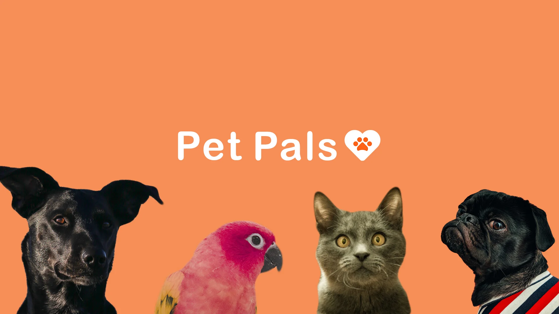
Pet Pals
Research | App Design | UI/UX | 2018
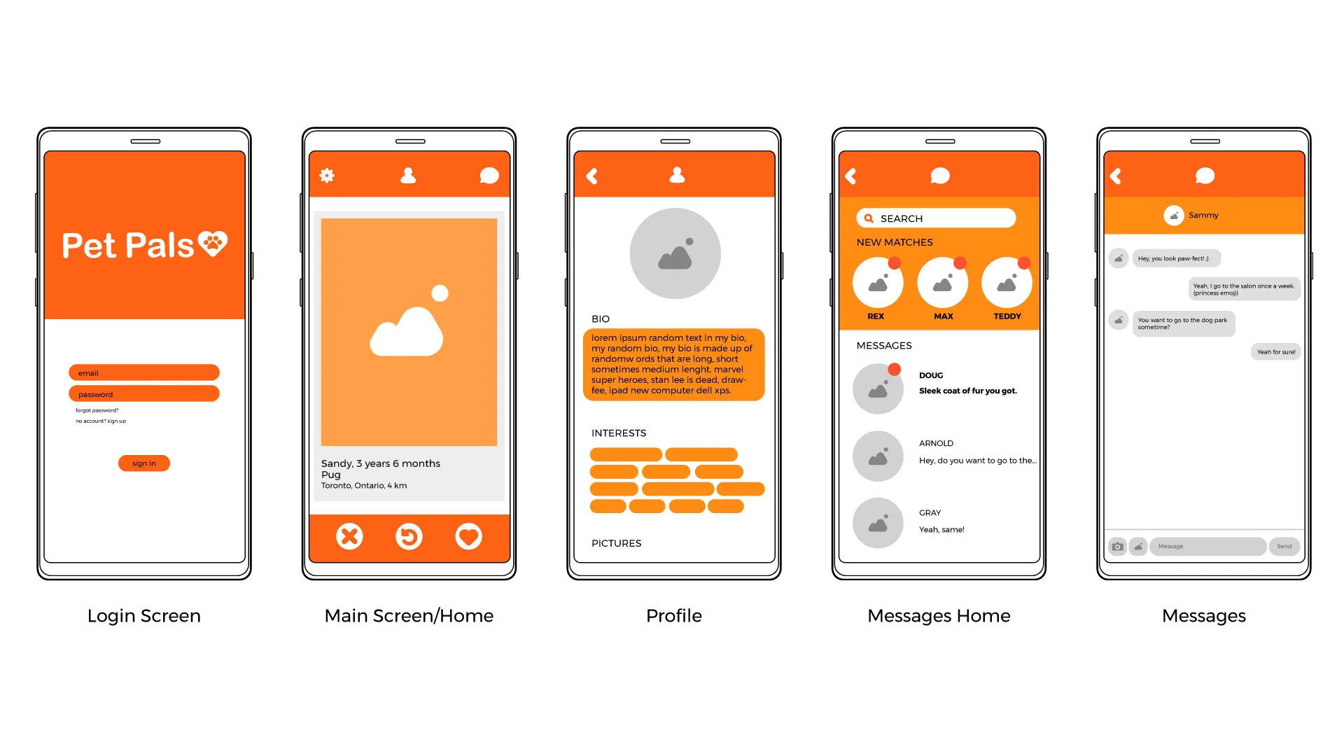
WHERE TO START
Pet Pals is a humorous intersection of my love for animals and a dating/meeting platform. I wanted to create an app that helped pet owners create “dating-site” like profiles for their pets, and “match” with other pets to go on play dates with. I thought that it would be a fun exercise to explore the interface and experience a dating/meeting app creates when the experience isn’t user centered but rather “pet-centered”, all while creating a fun concept and seeing it through interface development.
THE IDEA
Creating a dating app for pets (and their owners) to meetup with other pets (and their owners) and take long walks (by their owners as well) on the beach.
THE FLOW
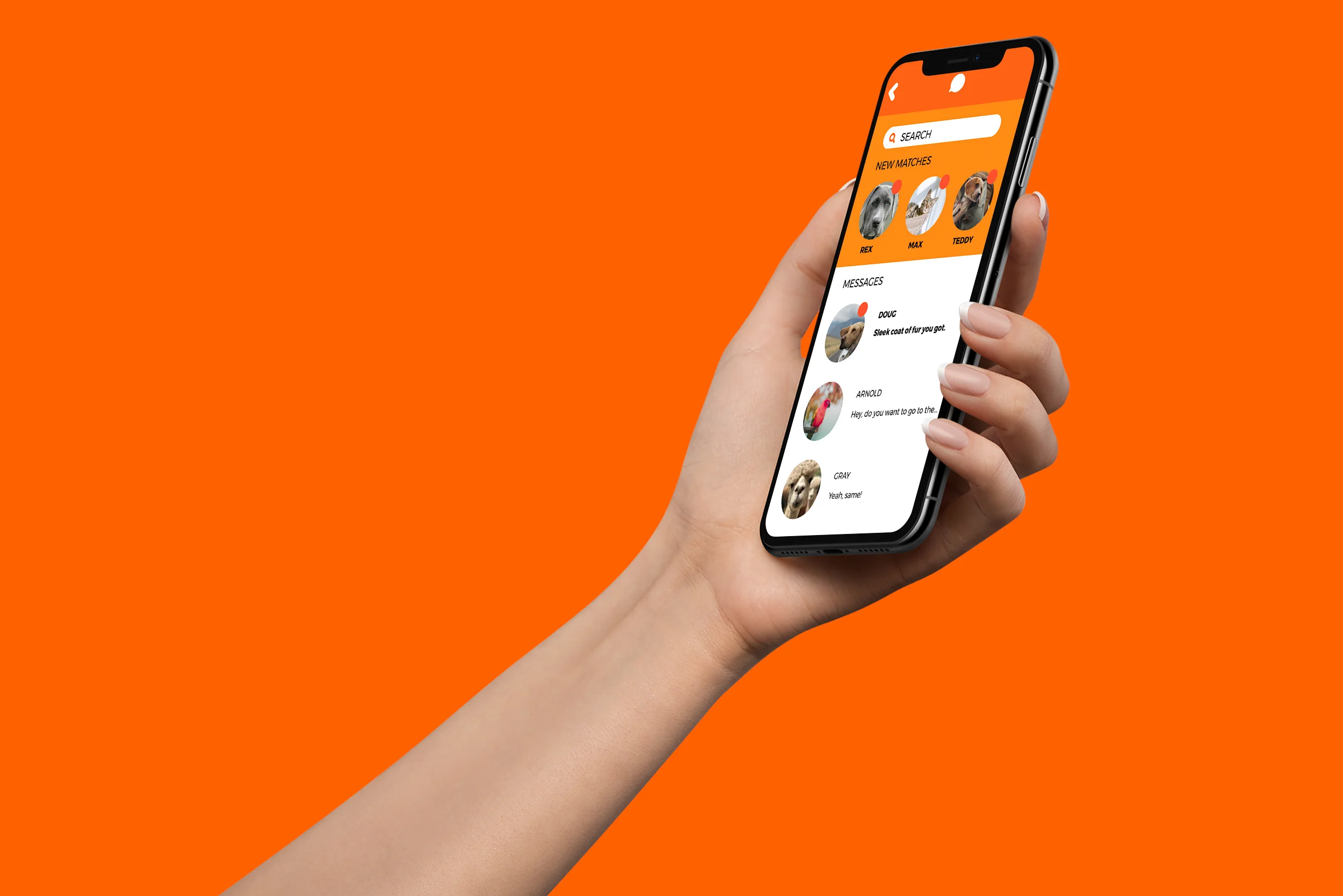
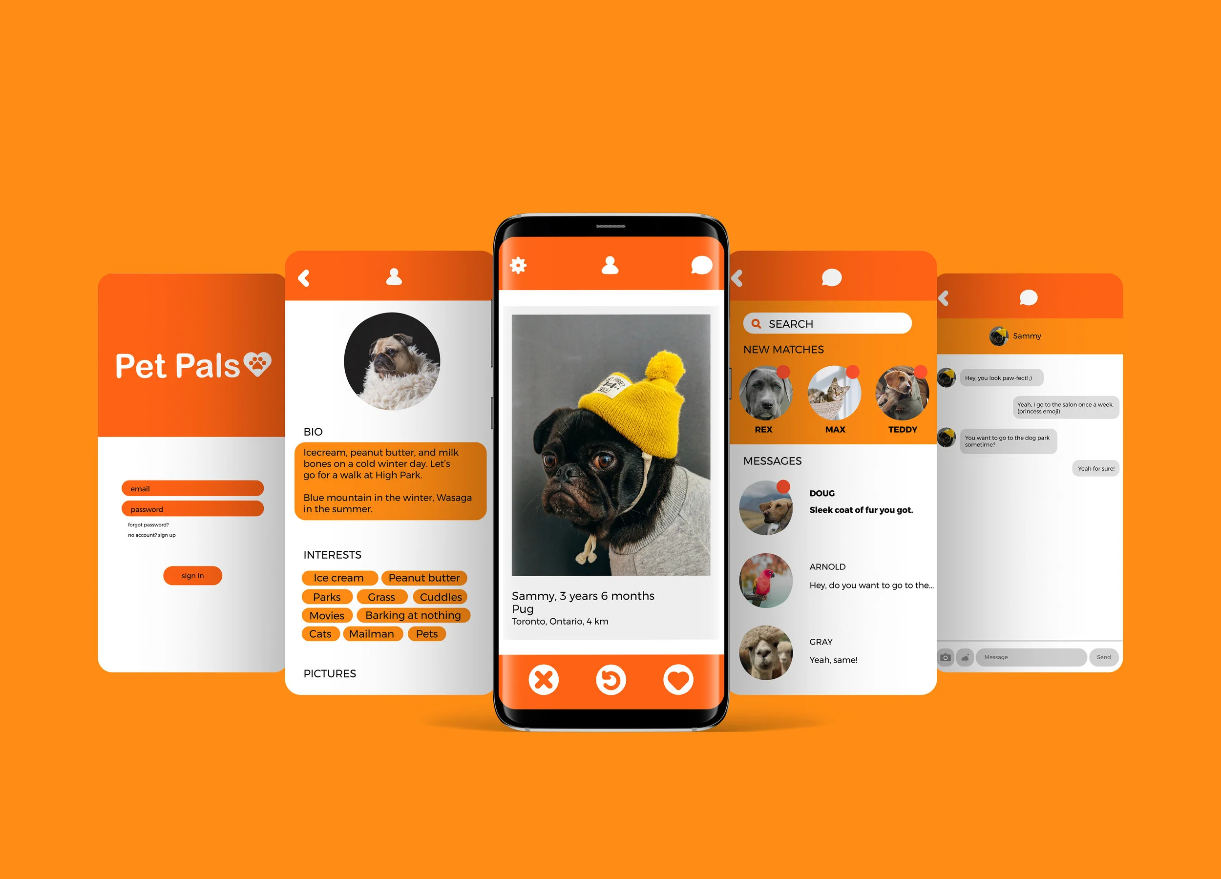
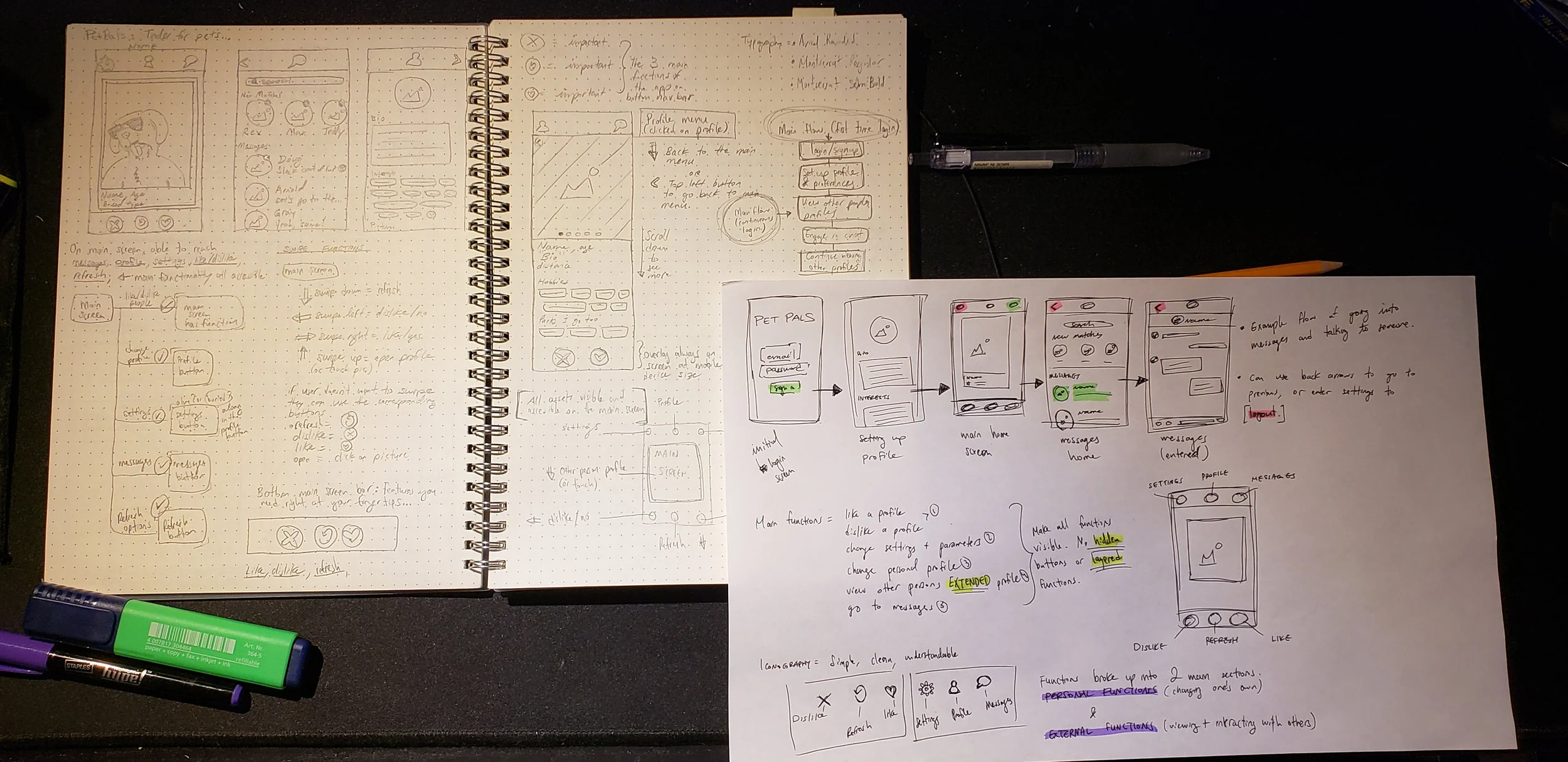
The interface design is kept clean and minimal. On the main screen of the app, everything is divided into 2 main sections. The top section has the users settings, profile, and messages, while the bottom half are the interaction buttons (dislike, refresh, and like). As part of an easier and intuitive user experience, I adopted traditional and commonly used swipe movements into the app. Swiping down refreshes the main screen, swiping left is “dislike” and swiping right is “like” (like Tinder), and swiping up (or touching on the image/profile) opens the profile and leads to a different screen that opens the person of interests information (similar to Snapchat and Tinder).
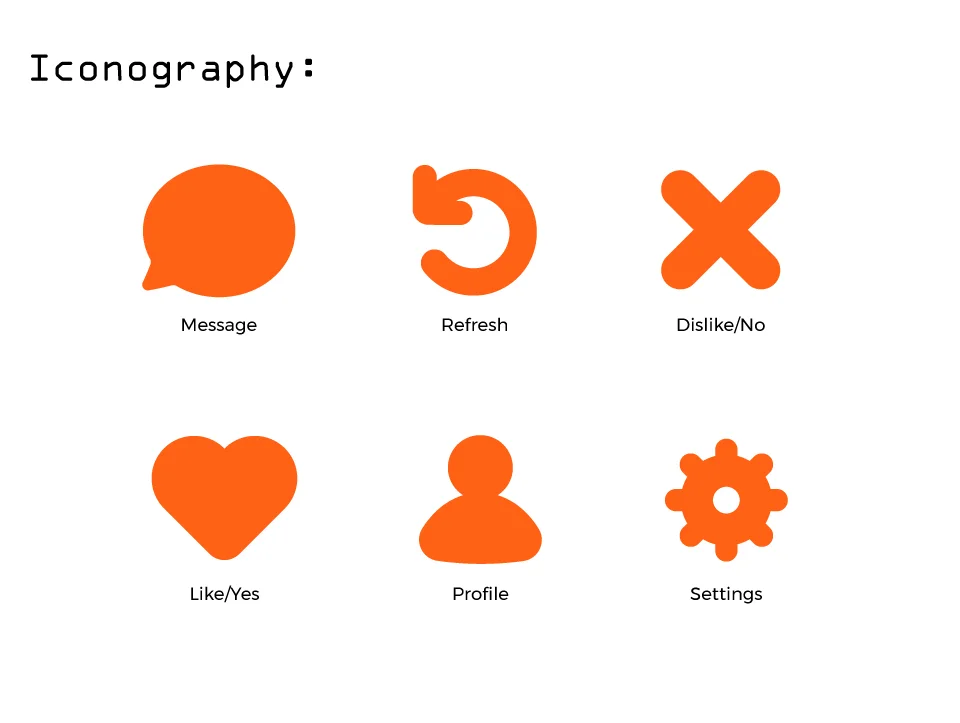
I wanted to keep the iconography for the project simple. I mapped the main functions to come down to 6 features, and made an icon for each with a more rounded and nice “bubbly” style.
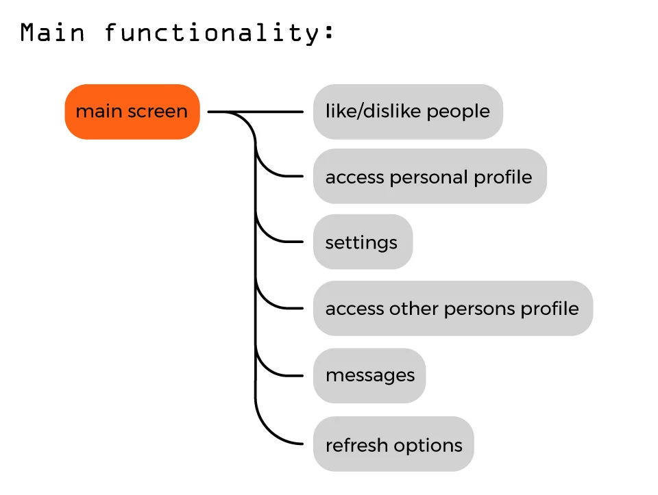
The main functions and purpose of the app were identified as: liking/disliking people, accessing your personal profile, accessing another persons profile, settings, refreshing options, and accessing messages. With this in mind, I made it that all of these main functions were reachable through the main screen. No functions were hidden with everything available to a user on one screen, while not creating too much screen clutter as well.
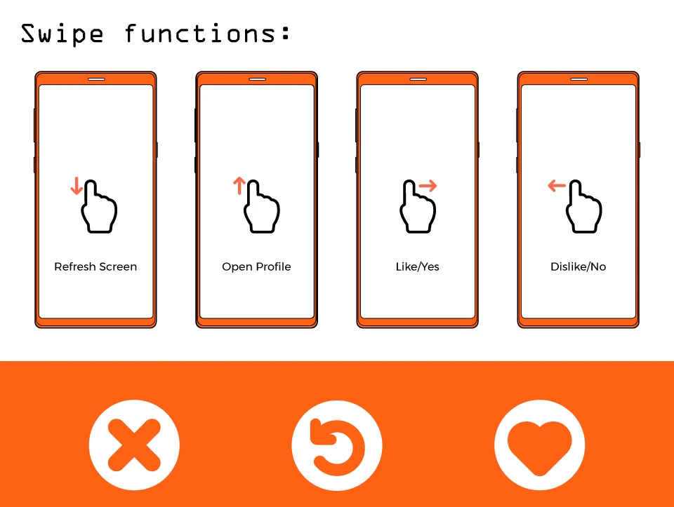
I intended the app to be used with similar functions to Tinder while also adopting common swipe functions adopted through Snapchat and other common applications. The user has the option to use swipe functions to navigate through other user profiles, such as swiping left to dislike, swiping right to like, swiping down to refresh, and swiping up to open the other person’s profile. There are also 3 main buttons on the button as well for those not familiar with swiping or for those who don’t want to use that function. These 3 buttons cover the same functionality as well, but instead of swiping up to open a profile, one can just tap the image on the screen to open.
THE PRODUCT
A fun, quirky, and “not-to-be-taken-too-seriously” dating app for pets and their owners. The user interface and experience was designed to be rich and informative enough that everything is available to you and easy to understand, and simple enough that even a dog could go through it.